12 Common Mistakes to Avoid When Designing a Dashboard
Written by UIDesignz Mar 5, 2024 3 min read

Dashboards have become a mainstay in the modern landscape of data analysis. They offer a visually compelling way to track progress, identify trends, and make informed decisions. However, a poorly designed dashboard can quickly transform from a valuable tool into a confusing mess. To ensure your custom dashboard design effectively communicates insights and drives action, avoid these 12 common pitfalls.
Table of Contents
Information Overload
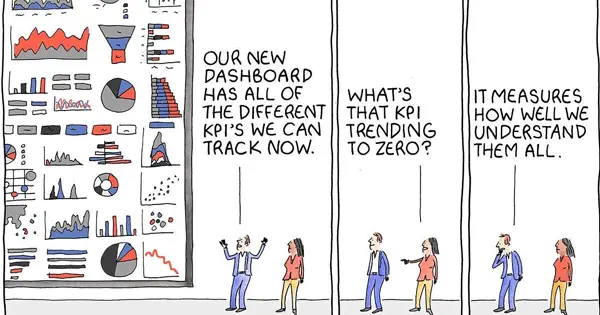
Cramming too many metrics, charts, and data points onto a single screen overwhelms users and reduces the impact of key information. Focus on 5-7 core KPIs that align with your audience's specific needs and goals.

Information Overload (image by Medium)
Chart Confusion
Not all charts are created equal. Choose the right UI UX design agency for the data you're presenting. Pie charts, for example, struggle with large datasets, while line graphs excel at showing trends over time. Remember, clarity beats aesthetics.
Keep Reading: Top App Design Techniques for Seamless User Navigation
Color Chaos
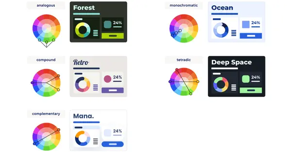
While color can be powerful, overuse or color blindness can hinder understanding. Stick to a few complementary colors, ensuring they are accessible for all viewers.

Color Chaos (image by Smartsheet)
Inconsistent Design
A mishmash of fonts, colors, and layouts creates a jarring experience. Develop a consistent design language that aligns with your brand and identity services that makes navigation intuitive.
Unclear Labels and Acronyms
Jargon and abbreviations detach users. Clearly label axes, legends, and data points. Use plain language and explain any technical terms.
Interactive Inaccessibility
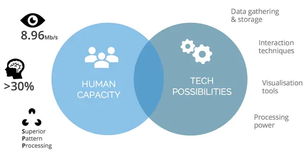
Interactive features are great, but ensure they work seamlessly across different devices and browsers. Test your dashboard thoroughly for optimal great user experience.

Interactive Inaccessibility (image by SONALAKE)
Static Data
Real-time or frequently updated data is crucial for informed decision-making. Avoid static snapshots that become outdated quickly.
Forgetting the Audience
Tailor your dashboard to the specific needs and goals of your users. What questions do they need to be answered? What actions should they be able to take?
Neglected Accessibility
Make your dashboard design services accessible to everyone, including users with disabilities. Use alt text for images, ensure proper color contrast, and offer keyboard navigation options.

Neglected Accessibility (image by UCLA)
Lack of Storytelling
Don't just present data, tell a story. Highlight key trends, draw insights, and provide actionable recommendations.
Missing Context
Numbers alone don't tell the whole picture. Provide context by including benchmarks, historical comparisons, and trendlines. Help users understand what's good, bad, and why.
Ignoring Feedback
Your dashboard is a living document. Gather feedback from users and iterate based on their needs.

Ignoring Feedback (image by Linkedin)
Conclusion
By avoiding these common mistakes, you can create powerful dashboards that unlock the true potential of your data and drive informed decision-making across your organization. Remember, dashboard design is an art and a science. By focusing on clarity, usability, and storytelling, you can transform your data into actionable insights that empower success.
To avail our offered services by Professionals kindly Contact Us.


